I have no intention of rewriting the particular pages in question, but I will lift out a number of things that stood out to me as I studied them. In the publishers note to the readers on page A10, as it is marked in the top left corner of the page, the final paragraph seemed like a good summary of the preceding text and I will quote it here for you.
"We believe that the New Living Translation- which combined the latest Biblical scholarship with a clear, dynamic writing style - will communicate God's word powerfully to all who read it. We publish it with the prayer that God will use it to speak his timeless truth to the church and the world in a fresh, new way."
There then follows a number of pages in which a rather detailed explanation is given of how they went about translating the Bible. I once again encourage you to read it for yourself. Page A11 is an introduction to what follows and I once again found the last paragraph to be a rather good summary of the preceding text on Translation Philosophy and Methodology.
It speaks of different translation philosophies which are at opposite ends of the translation spectrum, while asserting that the NLT necessarily drew upon both philosophies to produce and accurate and true, yet readable and understandable text for the modern reader. The pages that follow will expand on the compromises that had to be reached in this process, as well as to point out that the reader still has access to omitted texts or alternative readings, explaining how they made this possible.
For the Afrikaans readers of this blog, I will include links to two previously published blogs on the formation and translation of the modern Bible:
Bybel Legkaart: Sinopsis van Bybelkunde Deel 1
Bybel Legkaart: Sinopsis van Bybelkunde Deel 2
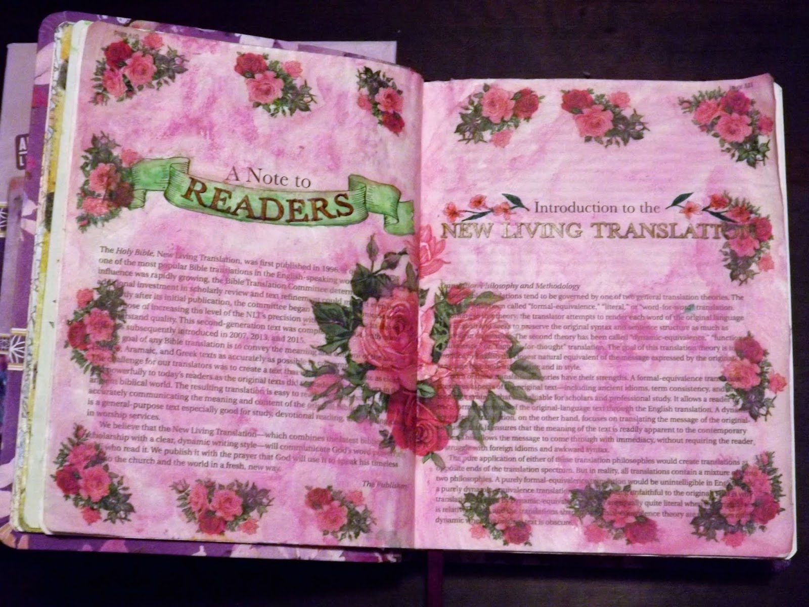
These are the two pages that today's blog deals with.

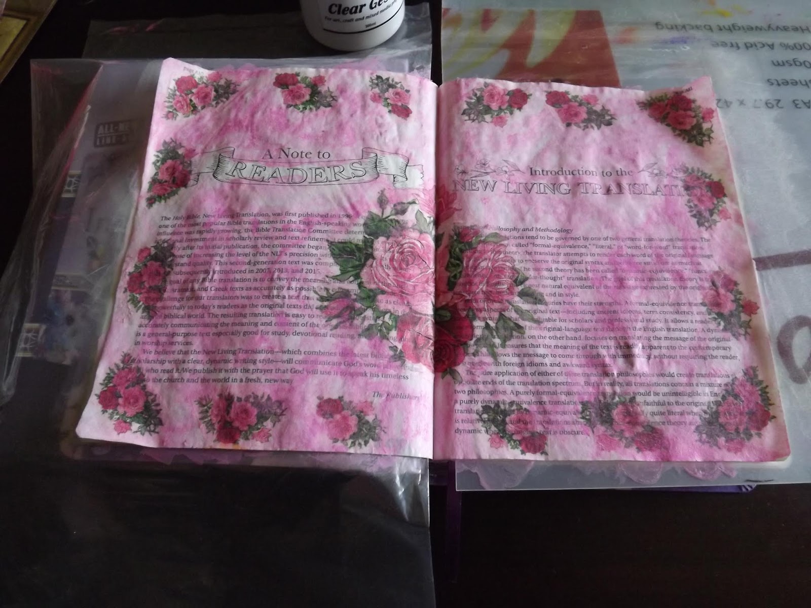
I started off by coating the two pages with a layer of gesso. I then allowed it to dry to the point where it was touch dry.

I then slipped the protection shield in between the two treated pages and closed the Bible to straighten out the warped and buckling pages.

This is what the pages looked like after it was treated.

I decide to decorate the page by decoupaging a serviette onto it.

I start by removing the backing paper from the serviette.

I then cut the whole serviette up and lay it on the paper in a way that I appeals to me. I decide to take a risk by decoupaging the focal point of the serviette across two pages. I know that I need to be very careful not to glue the two pages together with decoupage medium, where they meet in the spine.

I use Dala Acrylic Matt Glaze Medium to decoupage the serviette onto the Bible pages.

Once the page is dry, I seal the serviettes with the Zellen Clear Gesso to make sure that all other mediums will stick to my background.

I scribble over the page with a Faber-Castell Gelato stick. Then I use an aqua brush to wet and lift the colour from the gelato and to paint the whole page unevenly in the pale pink colour. I prefer uneven backgrounds as I find these more interesting than even ones. You may differ from me on this point.

I leave the pages to dry completely before I continue.
I then scribble over the text banner with green Gelato and then paint the banner with water.

I use two ProMarkers to colour the headings on the pages.

Then I use Staedtler Fineliners to colour the pictures surrounding the heading.

The completed pages.
You can watch a short compilation video of the steps above on YouTube:
https://youtu.be/pUyX3HV_10c
Unless otherwise indicated, all scripture quotations are taken from the Holy Bible, New Living Translation, copyright 1996, 2005,2015 by Tyndale House Foundation. Used by permission of Tyndale House Publishers, Inc., Carol Stream, Illinois, 60188. All rights reserved.
Inspire PRAISE South Africa edition copyright 2017 by Christian Art Publishers, PO Box 1599, Vereeniging, 1930, RSA. All rights reserved.
Marietjie Uys (Miekie) is a published author. You can buy my books here:
You can purchase Designs By Miekie 1 here.
Jy kan Kom Ons Teken en Verf Tuinstories hier koop.
Jy kan Kom Ons Kleur Tuinstories In hier koop.
Jy kan Tuinstories hier koop.
You can follow Miekie's daily Bible Study blog, Bybel Legkaart, here in English & Afrikaans.
You may prefer to follow the traveling blog, A Pretty Tourist.
For more crafty ideas and great product reviews, visit A Pretty Talent on Facebook.
If you are in a literary mood, follow Miekie's musings, stories and poetry on A Pretty Author - Miekie.
Remember to keep nurturing your TALENT for making life PRETTY.
You can subscribe to any of these blogs and receive regular updates by email. Simply register your email address at the top of the applicable blog.
No comments:
Post a Comment